How to use Neutrals to Create Depth in a Mixed Media Collage
Is your artwork relying on bright color instead of strong composition?
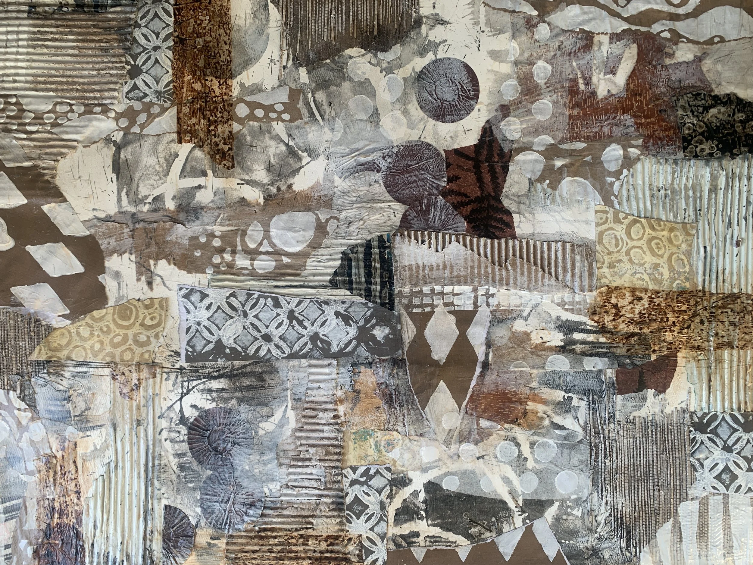
In this Monday Marks Vlog, I explore how working with a neutral palette can strengthen composition, build cohesion, and develop a more intentional mixed media collage practice. Through mixing custom neutral paints, creating layered collage papers, and building a composition using value first, this episode demonstrates how restraint can lead to more powerful and meaningful artwork.
Artistic Strategy
Strategy 1: Value Before Color
Build composition using only neutrals. Focus on contrast and balance before adding any saturated color.
Strategy 2: Accent with Intention
If color is added, use it sparingly and deliberately — no reactive choices.
Strategy 3: Getting Started
Mix complementary colors to create complex neutrals.
Create warm and cool versions.
Paint onto wet strength tissue/deli paper.
Add subtle scraping, lifting, or light stenciling.
Dry and sort by value (light/mid/dark).
Strategy 4: Building the Collage
Start with largest neutral shapes.
Establish light vs dark balance.
Add mid-tone transitions.
Introduce subject in a slightly shifted neutral.
Optional: Add one restrained accent color.
Reflective Questions
Does your composition work without bright color?
Where is your strongest value contrast?
Are your neutrals mostly warm or cool?
What emotion do these muted tones evoke?
Did limiting your palette change your decision-making?
Where could you simplify further?
Does your accent color serve the composition?
What feels grounded?
What feels unresolved?
Could this become a series?
Conclusion
Neutrals build sophistication.
Restraint builds voice.
Color becomes intentional rather than decorative.
This is groundwork for deeper storytelling.
If you’re a mixed media artist who wants structured, layered growth in your practice, this is exactly what we explore inside Paste and Paper Playground. Learn more about the membership here
limiting your palette and focusing on value, temperature, and layering, you can create artwork that feels grounded, intentional, and visually powerful.
Materials Used
Golden Heavy Body Acrylic paints and High Flow Acrylic Ink: Burnt umber, Raw sienna, Payne’s gray, Titanium white, Titan Buff
Gesso
Wet strength tissue paper
Golden Gloss Medium
Speedball India Ink
PVA Glue
Stencils
Soft brushes
Substrate (heavy paper or panel)
Cardboard, Birch Bark, Corrugated Paper